


Inflation & You
by WaldoStackjoiner
How inflation has been stealing your time, over time: A pre-bitcoin rabbit hole
Inflation. By now most Americans are familiar with its effects through direct experience, given its 40-year highs. However, it’s been there all along, silently stealing our time and leaving us worse off than we were before.
A hard money standard, albeit flawed
It wasn’t always like this. Before the end of the Gold Standard in 1971, different income groups experienced similar improvements relative to each other. In other words, income inequality occurred at a much lower rate because the money could not be manipulated in the same way as it can today.
Figure 1: Bottom 90% income and wealth 1917-2012
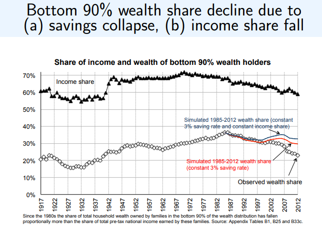
Figure 1 shows trends over time for both income and wealth. We can see that the shares of income and wealth for the bottom 90% were rising for much of the 20th century. Then, around 1971, income started falling, with wealth lagging behind but then falling, as well; we notice that if a 3% savings rate were maintained, the share of wealth would be higher for the bottom 90%, but because income was falling, people couldn’t keep saving at the same rate.
Figure 2: Top 1% income, 1913-2919
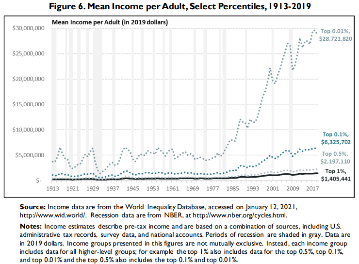
Figure 2 demonstrates that even within the top 1% we hear so much about, for most of this group, only relatively minor increases in income were realized. Within this group, however, it was really the top 0.1% and especially the top 0.01% that experienced parabolic gains since the 1970s.
Figure 3: Average annual change in mean family income, 1950-2010
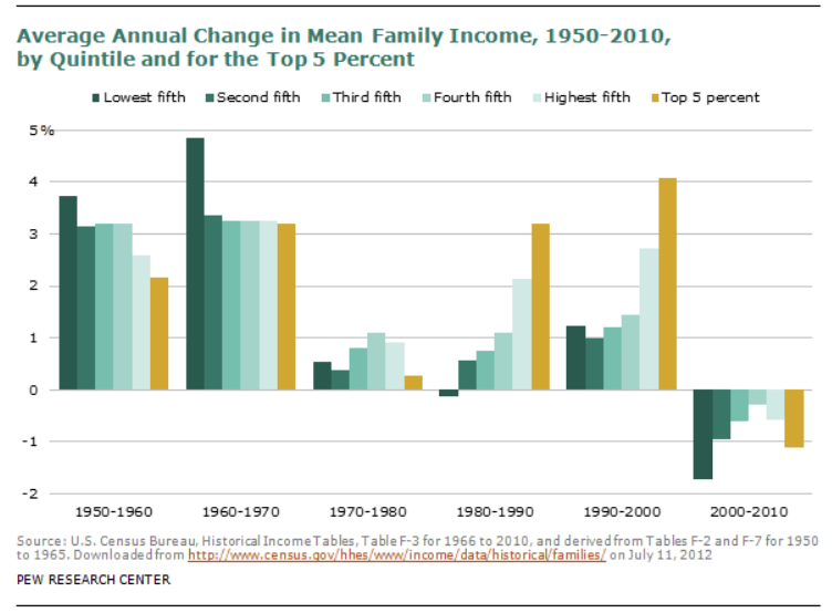
Finally, Figure 3 shows us that before 1971, YoY changes in income benefited all groups, especially the lowest and middle quintiles. This was the period where the Middle Class in America was built, where a single earner could afford a home, before income inequality and inflation took off in the opposite direction. Starting in the 1970s and especially afterwards, the 1950-1960s pattern reversed, leading to slowing and even negative growth. The Middle Class has been dying ever since.
1971-present day, the fiat currency era
As these initial charts suggest, things have been getting much worse for the majority of Americans since 1971. When easy money, not tied to a hard money standard, begins to flow, it benefits those at the top primarily at the expense of everyone else. Those left behind experience a slow sustained bleed of their labor not keeping up with their expenses.
Figure 4: Inflation compared to the median earner, 1971-2022
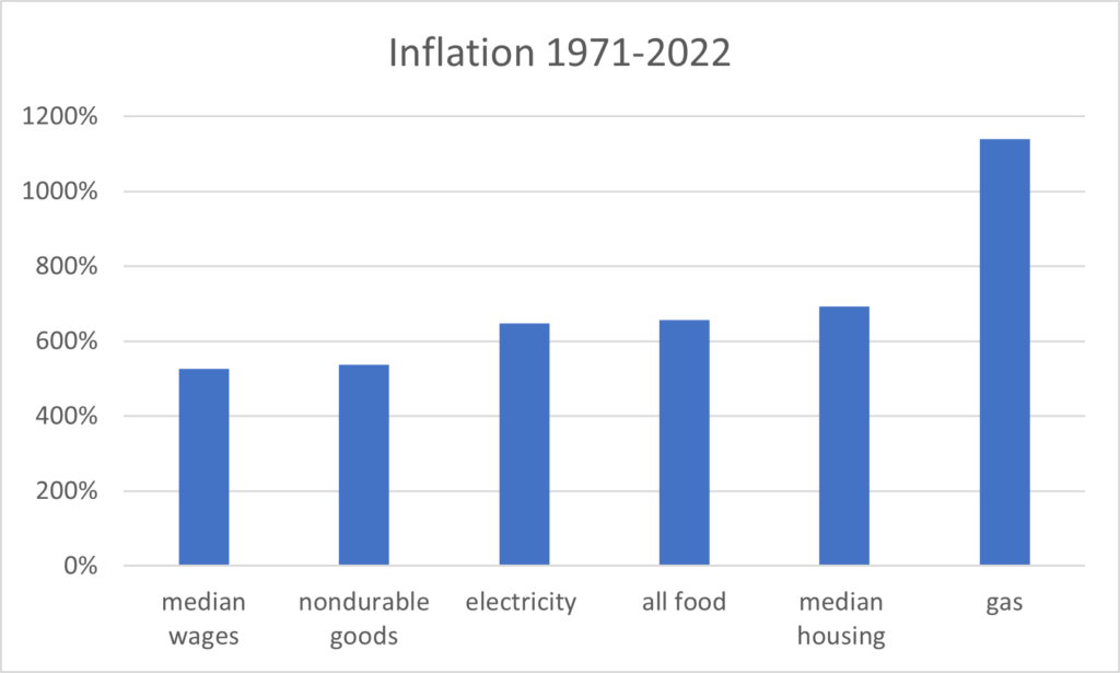
Figure 4 presents data from BLS. The “median wages” indicator means 50% of all working Americans are below this level. As we can see, Americans at and below the median earner have been falling behind for 50 years on each of these items, ones that are needed for daily living. (Estimates from this and other sources suggest it’s around the bottom 70% who haven’t been able to match daily expenses with wages).
Figure 5: Real average annual income growth, 1980-2014
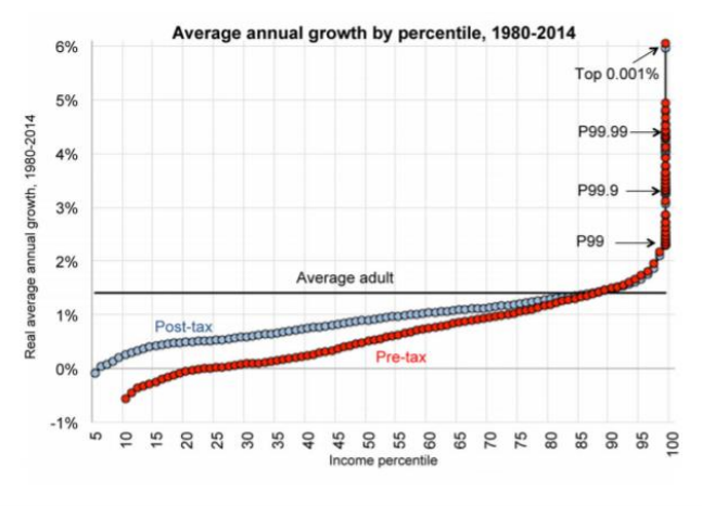
Figure 5 is a good complement to Figure 2, showing that after accounting for inflation, income growth has been relatively low for the bottom 99% in this time period. Once we dive into the top 1%, we can see the subgroups who have experienced the most growth, a pattern that did not exist before 1971 in the same way.
Figure 6: Wage gap, 2007-2023
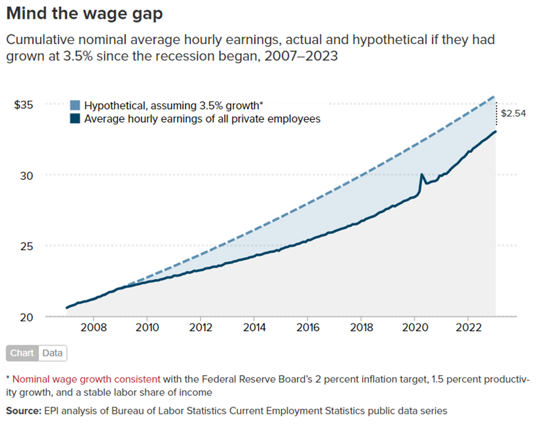
Figure 6 shows nominal wages (excluding inflation). The assumption of only 3.5% growth per year (2% for “official” inflation, 1.5% for productivity growth) still falls behind reality. Further, inflation as of April 2023 is 5%, so the reality is much worse for most Americans.
CPI, a poor metric for actual daily expenses
When discussing inflation, the numbers that are put out by officials and the media are based on the Consumer Price Index (CPI). The problem with this metric is that definitions can be changed, so it’s important to compare real costs that people encounter daily.
Figure 7: Sample YoY inflation, February 2022-2023
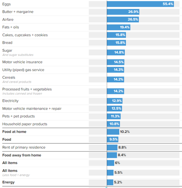
Figure 7 shows a sample year of inflation, 2/2022-2/2023, which demonstrates the problem with CPI as a good measuring stick. In this year, “official” CPI was at 6%, but other costs – things people need to live on a daily basis – were much higher, such as food, rent, electricity and gas. This is how inflation operates: there are “official” measures and there are real, experienced measures that people need to navigate.
Welcome to the Bitcoin rabbit hole
The purpose of this article was to demonstrate how inflation operates and how it has changed over time, especially since the U.S. abandoned the Gold Standard. It’s important to note that leaving the Gold Standard was only possible because of gold’s inherent flaws.
As the world discusses a return to hard money – and as you may wonder how you will possibly combat inflation if you’re in the bottom 90% (especially the bottom 50%) – this is the moment for which Bitcoin was built.
Whether or not you find that true for yourself depends on whether you are willing to invest the time and energy into learning what bitcoin is, why it’s superior to gold in every way, and most importantly, how over time it will protect your hard work from the hidden theft of inflation. The choice to dive into the bitcoin rabbit hole is yours and there’s no better time than now.
________________
Notes from Stackchain Magazine: Waldo was not paid to contribute this article to Stackchain Magazine, if you found it entertaining or enlightening please consider sending him a tip to his LNURL richestrod82@walletofsatoshi.com